Dell EMC Data Science Associate Certification Questions and Answers (Dumps and Practice Questions)
Question As part of HadoopExam consultency team, you have been given a requirement by a Hotel to create
a GUI apllication, so all the hotel's sales or booking you will add and edit the customer information, and you dont want to spend the
money on enterprize RDBMS, hence decided simple file as a storage and considered the csv file. So HDFS is the better choice for
storing such information in the file.

1. No, because HDFS is optimized for read-once, streaming access for relatively large files.
2. No, because HDFS is optimized for write-once, streaming access for relatively large files.
3. Access Mostly Uused Products by 50000+ Subscribers
4. Yes, because HDFS is optimized for write-once, streaming access for relatively large files.
Correct Answer : Get Lastest Questions and Answer :
Explanation: HDFS has a client API that can be used to access data from any Java application, even those that are not MapReduce applications. HDFS is optimized, however, for streaming access to relatively large files, and HDFS does not allow arbitrary modification of a file once it has been written. (In some cases it may be possible to append to a file after it has been written.) For more information, see chapter 2 of Hadoop: The Definitive Guide, 3rd Edition in the Design of HDFS section .
Watch the module : 2 from http://hadoopexam.com/index.html/#hadoop-training
Question : All HadoopExam website subscribers information is stored in the MySQL database,
Which tool is best suited to import a portion of a subscribers information every day as files into HDFS,
and generate Java classes to interact with that imported data?
1. Hive
2. Pig
3. Access Mostly Uused Products by 50000+ Subscribers
4. Flume
Correct Answer : Get Lastest Questions and Answer :
Explanation: Sqoop ("SQL-to-Hadoop") is a straightforward command-line tool with the following capabilities:
" Imports individual tables or entire databases to files in HDFS
" Generates Java classes to allow you to interact with your imported data
" Provides the ability to import from SQL databases straight into your Hive data warehouse
After setting up an import job in Sqoop, you can get started working with SQL database-backed data from your Hadoop MapReduce cluster in minutes.
The input to the import process is a database table. Sqoop will read the table row-by-row into HDFS. The output of this import process is a set of files containing a copy of the imported table. The import process is performed in parallel. For this reason, the output will be in multiple files. These files may be delimited text files (for example, with commas or tabs separating each field), or binary Avro or SequenceFiles containing serialized record data.
A by-product of the import process is a generated Java class which can encapsulate one row of the imported table. This class is used during the import process by Sqoop itself. The Java source code for this class is also provided to you, for use in subsequent MapReduce processing of the data. This class can serialize and deserialize data to and from the SequenceFile format. It can also parse the delimited-text form of a record. These abilities allow you to quickly develop MapReduce applications that use the HDFS-stored records in your processing pipeline. You are also free to parse the delimiteds record data yourself, using any other tools you prefer.
Watch the module : 22 from http://hadoopexam.com/index.html/#hadoop-training
Question : You are using K-means clustering to classify customer behavior for a large retailer. You need to
determine the optimum number of customer groups. You plot the within-sum-of-squares (wss)
data as shown in the exhibit. How many customer groups should you specify?
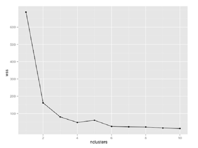
1. 2
2. 3
3. Access Mostly Uused Products by 50000+ Subscribers
4. 8
Correct Answer : Get Lastest Questions and Answer :
Explanation:
Related Questions
Question :
In a certain hospital there are two surgeons. Surgeon A operates on 100 patients, and 95 survive.
Surgeon B operates on 80 patients and 72 survive.
We are considering having surgery performed in this hospital and living through the operation is something
that is important. We want to choose the better of the two surgeons.
We did some further research into the data and found that originally the hospital had considered
two different types of surgeries, but then lumped all of the data together to report on each of its surgeons.
Not all surgeries are equal; some were considered high-risk emergency surgeries, while others were
of a more routine nature that had been scheduled in advance.
Of the 100 patients that surgeon A treated, 50 were high risk, of which three died. The other 50
were considered routine, and of these 2 died.
Now we look more carefully at the data for surgeon B and find that of 80 patients, 40 were high risk,
of which seven died. The other 40 were routine and only one died.
Now select the which statement is true about above scenario

1. If your surgery is to be a routine one, then surgeon B is actually the better surgeon
2. If your surgery is to be a routine one, then surgeon A is actually the better surgeon
3. Access Mostly Uused Products by 50000+ Subscribers
4. Data is not sufficient
Question :
You are a doctor in charge of a large hospital, and you have to decide which treatment should be used for a particular disease.
You have the following data from last month: there were 390 patients with the disease. Treatment A was given to 160 patients of
whom 100 were men and 60 were women; 20 of the men and 40 of the women recovered. Treatment B was given to 230 patients of
whom 210 were men and 20 were women; 50 of the men and 15 of the women recovered. Which treatment would you recommend
we use for people with the disease in future?
1. Treatment A, which seemed better in the overall data, was worse for both men and women when considered separately.
2. Treatment B, which seemed better in the overall data, was worse for both men and women when considered separately.
3. Access Mostly Uused Products by 50000+ Subscribers
4. We can safely give everyone treatment B
Question :
Select the correct statement for AUC which is a commonly used evaluation method in measuring the accuracy and quality of a recommender system
1. is a commonly used evaluation method for binary choice problems,
2. It involves classifying an instance as either positive or negative
3. Access Mostly Uused Products by 50000+ Subscribers
4. 1 and 2 only
5. All 1,2 and 3
Ans :4
Exp : AUC is a commonly used evaluation method for binary choice problems, which involve classifying an instance as either positive or negative. Its main advantages over other evaluation methods, such as the simpler misclassification error, are:
1. It's insensitive to unbalanced datasets (datasets that have more installeds than not-installeds or vice versa).
2. For other evaluation methods, a user has to choose a cut-off point above which the target variable is part of the positive class (e.g. a logistic regression model returns any real number between 0 and 1 - the modeler might decide that predictions greater than 0.5 mean a positive class prediction while a prediction of less than 0.5 mean a negative class prediction). AUC evaluates entries at all cut-off points, giving better insight into how well the classifier is able to separate the two classes.
Question : You have created a recommender system for QuickTechie.com website, where you recommend the Software professional
based on some parameters like technologies, location, companies etc. Now but you have little doubt that this model is not
giving proper recommendation as Rahul is working on Hadoop in Mumbai and John from france is working on UI application created in flash,
are recommended as a similar professional, which is not correct. Select the correct option which will be helpful to measure the accuracy and quality of a recommender system you created for QuickTechie.com?
1. Cluster Density
2. Support Vector Count
3. Access Mostly Uused Products by 50000+ Subscribers
4. Sum of Absolute Errors
Ans : 3
Exp : AUC is a commonly used evaluation method for binary choice problems, which involve classifying an instance as either positive or negative. Its main advantages over other evaluation methods, such as the simpler misclassification error, are:
1. It's insensitive to unbalanced datasets (datasets that have more installeds than not-installeds or vice versa).
2. For other evaluation methods, a user has to choose a cut-off point above which the target variable is part of the positive class (e.g. a logistic regression model returns any real number between 0 and 1 - the modeler might decide that predictions greater than 0.5 mean a positive class prediction while a prediction of less than 0.5 mean a negative class prediction). AUC evaluates entries at all cut-off points, giving better insight into how well the classifier is able to separate the two classes.
The MAE measures the average magnitude of the errors in a set of forecasts, without considering their direction. It measures accuracy for continuous variables. The equation is given in the library references. Expressed in words, the MAE is the average over the verification sample of the absolute values of the differences between forecast and the corresponding observation. The MAE is a linear score which means that all the individual differences are weighted equally in the average.
The sum of absolute errors is a valid metric, but doesn't give any useful sense of how the recommender system is performing.
Support vector count and cluster density do not apply to recommender systems.
MAE and AUC are both valid and useful metrics for measuring recommender systems.
Question :
Scater plots provide the following information about the relationship between two variables
1. Strength
2. Shape - linear, curved, etc.
3. Access Mostly Uused Products by 50000+ Subscribers
4. Presence of outliers
1. 1,2,3
2. 1,3,4
3. Access Mostly Uused Products by 50000+ Subscribers
4. 2,3,4
5. All 1,2,3,4
Ans :5
Exp : Scatter plots show the relationship between two variables by displaying data points on a two-dimensional graph. The variable that might be considered an explanatory variable is plotted on the x axis, and the response variable is plotted on the y axis.
Scatter plots are especially useful when there are a large number of data points. They provide the following information about the relationship between two variables
Strength
Shape - linear, curved, etc.
Direction - positive or negative
Presence of outliers
A correlation between the variables results in the clustering of data points along a line. The following is an example of a scatter plot suggestive of a positive linear relationship.
Question : You are given a data set that contains information about tv advertisement placed between and of Zee News Channel
(Total Asia continent information). With the following detailed information.
Advertisement duration, Cost rate per minute of Advertissement, Country of the Advertisers, City from which addvertiser
Country to which advertise needs to be shown., City to which advertise needs to be shown., Month total advertisement
Days (of month) advertisement shown, Total hourds for which advertisement shown. , Total Minutes for which advertisement shown.
From the data set you can determine the frequencies of all the advertisement shown in Asia continent. For example, between 1990 and 2014,
500 advertisement were given from China to Shown in India, While 2000 advertisement given by Russia to shown in Japan.
Now you want to draw the pictue which shows the relation between Ad duration and cost per Minute, which technique you feel would be better.
1. Scatter plot
2. Tree map
3. Access Mostly Uused Products by 50000+ Subscribers
4. Box plot
5. Bar chart
Ans : 1
Exp : A scatter plot, scatterplot, or scattergraph is a type of mathematical diagram using Cartesian coordinates to display values for two variables for a set of data. The data is displayed as a collection of points, each having the value of one variable determining the position on the horizontal axis and the value of the other variable determining the position on the vertical axis. This kind of plot is also called a scatter chart, scattergram, scatter diagram, or scatter graph.
A heat map is a two-dimensional representation of data in which values are represented by colors. A simple heat map provides an immediate visual summary of information. More elaborate heat maps allow the viewer to understand complex data sets. Another type of heat map, which is often used in business, is sometimes referred to as a tree map. This type of heat map uses rectangles to represent components of a data set. The largest rectangle represents the dominant logical division of data and smaller rectangles illustrate other sub-divisions within the data set. The color and size of the rectangles on this type of heat map can correspond to two different values, allowing the viewer to perceive two variables at once. Tree maps are often used for budget proposals, stock market analysis, risk management, project portfolio analysis, market share analysis, website design and network management. In descriptive statistics, a box plot or boxplot is a convenient way of graphically depicting groups of numerical data through their quartiles. Box plots may also have lines extending vertically from the boxes (whiskers) indicating variability outside the upper and lower quartiles, hence the terms box-and-whisker plot and box-and-whisker diagram. Outliers may be plotted as individual points. To visualize correlations between two variables, a scatter plot is typically the best choice. By plotting the data on a scatter plot, you can easily see any trends in the correlation, such as a linear relationship, a log normal relationship, or a polynomial relationship. A heat map uses three dimensions and so would be a poor choice for this purpose. Box plots, bar charts, and tree maps do not provide the kind of uniform special mapping of the data onto the graph that is required to see trends.
Question :
Which of the following provide the kind of uniform special mapping of the data onto the graph that is required to see trends.
1. Box plots
2. Bar charts
3. Access Mostly Uused Products by 50000+ Subscribers
4. All 1,2 and 3
5. None of 1,2 and 3
Ans 5
Exp : Box Plots:
In descriptive statistics, a box plot or boxplot is a convenient way of graphically depicting groups of numerical data through their quartiles. Box plots may also have lines extending vertically from the boxes (whiskers) indicating variability outside the upper and lower quartiles, hence the terms box-and-whisker plot and box-and-whisker diagram. Outliers may be plotted as individual points.
Box plots display differences between populations without making any assumptions of the underlying statistical distribution: they are non-parametric. The spacings between the different parts of the box help indicate the degree of dispersion (spread) and skewness in the data, and identify outliers. In addition to the points themselves, they allow one to visually estimate various L-estimators, notably the interquartile range, midhinge, range, mid-range, and trimean. Boxplots can be drawn either horizontally or vertically.
A heat map is a two-dimensional representation of data in which values are represented by colors. A simple heat map provides an immediate visual summary of information. More elaborate heat maps allow the viewer to understand complex data sets.
In the United States, many people are familiar with heat maps from viewing television news programs. During a presidential election, for instance, a geographic heat map with the colors red and blue will quickly inform the viewer which states each candidate has won.
Another type of heat map, which is often used in business, is sometimes referred to as a tree map. This type of heat map uses rectangles to represent components of a data set. The largest rectangle represents the dominant logical division of data and smaller rectangles illustrate other sub-divisions within the data set. The color and size of the rectangles on this type of heat map can correspond to two different values, allowing the viewer to perceive two variables at once. Tree maps are often used for budget proposals, stock market analysis, risk management, project portfolio analysis, market share analysis, website design and network management.
Question : You are given a data set that contains information about tv advertisement placed between and of Zee News Channel
(Total Asia continent information). With the following detailed information.
Advertisement duration, Cost rate per minute of Advertissement, Country of the Advertisers, City from which addvertiser
Country to which advertise needs to be shown., City to which advertise needs to be shown., Month total advertisement
Days (of month) advertisement shown, Total hourds for which advertisement shown. , Total Minutes for which advertisement shown.
From the data set you can determine the frequencies of all the advertisement shown in Asia continent. For example, between 1990 and 2014,
500 advertisement were given from China to Shown in India, While 2000 advertisement given by Russia to shown in Japan.
Now you want to draw the pictue which shows the relation between which contries given most advertisement in the other country.
Select the correct option.
1. Heat map
2. Tree map
3. Access Mostly Uused Products by 50000+ Subscribers
4. Bar chart
5. Scatter plot
Ans :1 Exp : A scatter plot, scatterplot, or scattergraph is a type of mathematical diagram using Cartesian coordinates to display values for two variables for a set of data. The data is displayed as a collection of points, each having the value of one variable determining the position on the horizontal axis and the value of the other variable determining the position on the vertical axis. This kind of plot is also called a scatter chart, scattergram, scatter diagram, or scatter graph.
A heat map is a two-dimensional representation of data in which values are represented by colors. A simple heat map provides an immediate visual summary of information. More elaborate heat maps allow the viewer to understand complex data sets.
Another type of heat map, which is often used in business, is sometimes referred to as a tree map. This type of heat map uses rectangles to represent components of a data set. The largest rectangle represents the dominant logical division of data and smaller rectangles illustrate other sub-divisions within the data set. The color and size of the rectangles on this type of heat map can correspond to two different values, allowing the viewer to perceive two variables at once. Tree maps are often used for budget proposals, stock market analysis, risk management, project portfolio analysis, market share analysis, website design and network management. In descriptive statistics, a box plot or boxplot is a convenient way of graphically depicting groups of numerical data through their quartiles. Box plots may also have lines extending vertically from the boxes (whiskers) indicating variability outside the upper and lower quartiles, hence the terms box-and-whisker plot and box-and-whisker diagram. Outliers may be plotted as individual points.
To visualize correlations between two variables, a scatter plot is typically the best choice. By plotting the data on a scatter plot, you can easily see any trends in the correlation, such as a linear relationship, a log normal relationship, or a polynomial relationship. A heat map uses three dimensions and so would be a poor choice for this purpose. Box plots, bar charts, and tree maps do not provide the kind of uniform special mapping of the data onto the graph that is required to see trends.In order to effectively visualize the advertisement source and destination frequencies, you'll need a plot that gives at least three dimensions: the source, destination, and frequency. A heat map provides exactly that. Scatter plots, box plots, tree maps, and bar charts provide at most two dimensions. In theory, you could use a three-dimensional variant of one of the two dimensions graphs, but three-dimensional graphs are never a good idea. Three-dimensional graphs can only be shown in two dimensions in print and hence cause visual distortions to the data. They can also hide some data points, and they make it very difficult to compare data points from different parts of the graph.
Question :
Which of the following graph can be best presented in two-dimension
1. Scatter plots
2. Box plots
3. Access Mostly Uused Products by 50000+ Subscribers
4. Bar charts
1. 1,2,3
2. 2,3,4
3. Access Mostly Uused Products by 50000+ Subscribers
4. 1,2,4
5. All 1,2,3 and 4
Ans : 5
Exp : A heat map provides exactly that. Scatter plots, box plots, tree maps, and bar charts provide at most two dimensions. In theory, you could use a three-dimensional variant of one of the two dimensions graphs, but three-dimensional graphs are never a good idea. Three-dimensional graphs can only be shown in two dimensions in print and hence cause visual distortions to the data. They can also hide some data points, and they make it very difficult to compare data points from different parts of the graph.
Question : You are given a data set that contains information about tv advertisement placed between and of Zee News Channel
(Total Asia continent information). With the following detailed information.
Advertisement duration, Cost rate per minute of Advertissement, Country of the Advertisers, City from which addvertiser
Country to which advertise needs to be shown., City to which advertise needs to be shown., Month total advertisement
Days (of month) advertisement shown, Total hourds for which advertisement shown. , Total Minutes for which advertisement shown.
From the data set you can determine the frequencies of all the advertisement shown in Asia continent. For example, between 1990 and 2014,
500 advertisement were given from China to Shown in India, While 2000 advertisement given by Russia to shown in Japan.
Now you want to draw the pictue which shows the relation between Ad dthat every city and country has of the overall ad data, which technique you feel would be better.
1. Scatter plot
2. Heat map
3. Access Mostly Uused Products by 50000+ Subscribers
4. Tree map
Ans : 4
Exp : To show the share of advertisement originations for every city and state, you'll need a way to show hierarchical information. A tree map is a natural choice, since it's designed for exactly that purpose. You could, however, use a stacked bar chart to present the same information. A heat map has an extra, unneeded dimension, which would make the graph confusing. A scatter plot is for numeric data in both dimensions. A box plot is for groupings of multiple values.
A scatter plot, scatterplot, or scattergraph is a type of mathematical diagram using Cartesian coordinates to display values for two variables for a set of data.
The data is displayed as a collection of points, each having the value of one variable determining the position on the horizontal axis and the value of the other variable determining the position on the vertical axis. This kind of plot is also called a scatter chart, scattergram, scatter diagram, or scatter graph.
A heat map is a two-dimensional representation of data in which values are represented by colors. A simple heat map provides an immediate visual summary of information. More elaborate heat maps allow the viewer to understand complex data sets.
Another type of heat map, which is often used in business, is sometimes referred to as a tree map. This type of heat map uses rectangles to represent components of a data set. The largest rectangle represents the dominant logical division of data and smaller rectangles illustrate other sub-divisions within the data set. The color and size of the rectangles on this type of heat map can correspond to two different values, allowing the viewer to perceive two variables at once. Tree maps are often used for budget proposals, stock market analysis, risk management, project portfolio analysis, market share analysis, website design and network management.
In descriptive statistics, a box plot or boxplot is a convenient way of graphically depicting groups of numerical data through their quartiles. Box plots may also have lines extending vertically from the boxes (whiskers) indicating variability outside the upper and lower quartiles, hence the terms box-and-whisker plot and box-and-whisker diagram. Outliers may be plotted as individual points.
To visualize correlations between two variables, a scatter plot is typically the best choice. By plotting the data on a scatter plot, you can easily see any trends in the correlation, such as a linear relationship, a log normal relationship, or a polynomial relationship. A heat map uses three dimensions and so would be a poor choice for this purpose. Box plots, bar charts, and tree maps do not provide the kind of uniform special mapping of the data onto the graph that is required to see trends. In order to effectively visualize the advertisement source and destination frequencies, you'll need a plot that gives at least three dimensions: the source, destination, and frequency. A heat map provides exactly that. Scatter plots, box plots, tree maps, and bar charts provide at most two dimensions. In theory, you could use a three-dimensional variant of one of the two dimensions graphs, but three-dimensional graphs are never a good idea. Three-dimensional graphs can only be shown in two dimensions in print and hence cause visual distortions to the data. They can also hide some data points, and they make it very difficult to compare data points from different parts of the graph.
Question :
Which of the following is a correct use case for the scatter plots
1. Male versus female likelihood of having lung cancer at different ages
2. technology early adopters and laggards' purchase patterns of smart phones
3. Access Mostly Uused Products by 50000+ Subscribers
4. All of the above
Ans :4
Exp : Looking to dig a little deeper into some data, but not quite sure how - or if - different
pieces of information relate? Scatter plots are an effective way to give you a sense of
trends, concentrations and outliers that will direct you to where you want to focus your
investigation efforts further.
When to use scatter plots:
o Investigating the relationship between different variables. Examples: Male
versus female likelihood of having lung cancer at different ages, technology early
adopters' and laggards' purchase patterns of smart phones, shipping costs of
different product categories to different regions.
Question :
Which of the following places where we cannot use Gantt charts
1. Displaying a project schedule. Examples: illustrating key deliverables, owners, and deadlines.
2. Showing other things in use over time. Examples: duration of a machine's use,
3. Access Mostly Uused Products by 50000+ Subscribers
4. None of the above
Ans : 4
Exp : Gantt charts excel at illustrating the start and finish dates elements of a project. Hitting
deadlines is paramount to a project's success. Seeing what needs to be accomplished -
and by when - is essential to make this happen. This is where a Gantt chart comes in.
While most associate Gantt charts with project management, they can be used to
understand how other things such as people or machines vary over time. You could
use a Gantt, for example, to do resource planning to see how long it took people to hit
specific milestones, such as a certification level, and how that was distributed over time.
When to use Gantt charts:
o Displaying a project schedule. Examples: illustrating key deliverables, owners,
and deadlines.
o Showing other things in use over time. Examples: duration of a machine's use,
availability of players on a team.
Question :
Which of the following is the best example where we can use Heat maps
1. Segmentation analysis of target market
2. product adoption across regions
3. Access Mostly Uused Products by 50000+ Subscribers
4. All of the above
5. None of 1,2 and 3
Ans : 4
Exp : Heat maps are a great way to compare data across two categories using color. The
Effect is to quickly see where the intersection of the categories is strongest and weakest.
When to use heat maps:
Showing the relationship between two factors. Examples: segmentation analysis of target market, product adoption across regions, sales leads by Individual rep.
Question :
Which of the following cannot be presented using TreeMap?
1. Storage usage across computer machines
2. managing the number and priority of technical support cases
3. Access Mostly Uused Products by 50000+ Subscribers
4. None of the above
Question :
If you want to understanding your data at a glance, seeing how data is skewed towards one end, which is the best fit graph or chart.

1. Scatter graph
2. Tree Map
3. Access Mostly Uused Products by 50000+ Subscribers
4. Box-and-whisker plot
Ans : 4
Exp : : Box-and-whisker Plot
Box-and-whisker plots, or boxplots, are an important way to show distributions of data. The name refers to the two parts of the plot: the box, which contains the median of the data along with the 1st and 3rd quartiles (25% greater and less than the median), and the whiskers, which typically represents data within 1.5 times the Inter-quartile Range (the difference between the 1st and 3rd quartiles). The whiskers can also be used to also show the maximum and minimum points within the data. When to use box-and-whisker plots: o Showing the distribution of a set of a data: Examples: understanding your data at a glance, seeing how data is skewed towards one end, identifying outliers in your data.
Question :
Map the followings
1. Clustering
2. Classification
3. Access Mostly Uused Products by 50000+ Subscribers
A. Build models to classify data into different categories
B. Build models to predict continuous data.
C. Find natural groupings and patterns in data.

1. 1-A,2-B,3-C
2. 1-B,2-C,3-A
3. Access Mostly Uused Products by 50000+ Subscribers
4. 1-B,2-A,3-C
Ans : 3
Exp : Classification
Build models to classify data into different categories.
Algorithms: support vector machine (SVM), boosted and bagged decision trees, k-nearest neighbor, Naïve Bayes, discriminant analysis, neural networks,
Regression
Build models to predict continuous data.
Algorithms: linear model, nonlinear model, regularization, stepwise regression, boosted and bagged decision trees, neural networks, adaptive neuro-fuzzy learning
Clustering
Find natural groupings and patterns in data.
Algorithms: k-means, hierarchical clustering, Gaussian mixture models, hidden Markov models, self-organizing maps, fuzzy c-means clustering, subtractive clustering,
Question :
Which of the following is not a correct application for the Classification?
1. credit scoring
2. tumor detection
3. Access Mostly Uused Products by 50000+ Subscribers
4. drug discovery
Ans : 4
Exp : Classification : Build models to classify data into different categories
credit scoring, tumor detection, image recognition
Regression: Build models to predict continuous data.
electricity load forecasting, algorithmic trading, drug discovery
Question : You are building a classifier off of a very high-dimensional data set
similar to shown in the image with 5000 variables (lots of columns, not that many rows).
It can handle both dense and sparse input. Which technique is most suitable, and why?
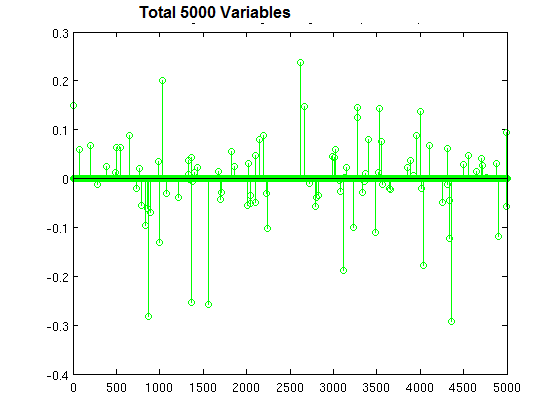
1. Logistic regression with L1 regularization, to prevent overfitting
2. Naive Bayes, because Bayesian methods act as regularlizers
3. Access Mostly Uused Products by 50000+ Subscribers
4. Random forest, because it is an ensemble method
Ans : 1 Exp : Logistic regression is widely used in machine learning for classification problems. It is well-known that regularization is required to avoid over-fitting, especially when there is a only small number of training examples, or when there are a large number of parameters to be learned. In particular, L1 regularized logistic regression is often used for feature selection, and has been shown to have good generalization performance in the presence of many irrelevant features. (Ng 2004; Goodman 2004) Unregularized logistic regression is an unconstrained con-vex optimization problem with a continuously differentiable objective function. As a consequence, it can be solved fairly efficiently with standard convex optimization methods, such as Newton's method or conjugate gradient. However, adding the L1 regularization makes the optimization problem com-putationally more expensive to solve. If the L1 regulariza-tion is enforced by an L1 norm constraint on the parameLogistic regression is a classifier, and L1 regularization tends to produce models that ignore dimensions of the input that are not predictive. This is particularly useful when the input contains many dimensions. k-nearest neighbors classification is also a classification technique, but relies on notions of distance. In a high-dimensional space, most every data point is "far" from others (the curse of dimensionality) and so these techniques break down. Naive Bayes is not inherently regularizing. Random forests represent an ensemble method, but an ensemble method is not necessarily more suitable to high-dimensional data. Practically, I think the biggest reasons for regularization are 1) to avoid overfitting by not generating high coefficients for predictors that are sparse. 2) to stabilize the estimates especially when there's collinearity in the data.
1) is inherent in the regularization framework. Since there are two forces pulling each other in the objective function, if there's no meaningful loss reduction, the increased penalty from the regularization term wouldn't improve the overall objective function. This is a great property since a lot of noise would be automatically filtered out from the model.
To give you an example for 2), if you have two predictors that have same values, if you just run a regression algorithm on it since the data matrix is singular, your beta coefficients will be Inf if you try to do a straight matrix inversion. But if you add a very small regularization lambda to it, you will get stable beta coefficients with the coefficient values evenly divided between the equivalent two variables.
For the difference between L1 and L2, the following graph demonstrates why people bother to have L1 since L2 has such an elegant analytical solution and is so computationally straightforward. Regularized regression can also be represented as a constrained regression problem (since they are Lagrangian equivalent). The implication of this is that the L1 regularization gives you sparse estimates. Namely, in a high dimensional space, you got mostly zeros and a small number of non-zero coefficients. This is huge since it incorporates variable selection to the modeling problem. In addition, if you have to score a large sample with your model, you can have a lot of computational savings since you don't have to compute features(predictors) whose coefficient is 0. I personally think L1 regularization is one of the most beautiful things in machine learning and convex optimization. It is indeed widely used in bioinformatics and large scale machine learning for companies like Facebook, Yahoo, Google and Microsoft.
Question : Consider the following confusion matrix for a data set with out of , instances positive:
In this case, Precision = 50%, Recall = 83%, Specificity = 95%, and Accuracy = 95%.
Select the correct statement
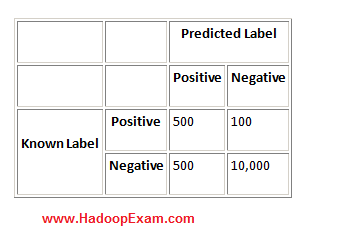
1. Precision is low, which means the classifier is predicting positives best
2. Precision is low, which means the classifier is predicting positives poorly
3. Access Mostly Uused Products by 50000+ Subscribers
4. 1 and 3
5. 2 and 3
Ans : 5
Exp : In this case, Precision = 50%, Recall = 83%, Specificity = 95%, and Accuracy = 95%. In this case, Precision is low, which means the classifier is predicting positives poorly. However, the three other measures seem to suggest that this is a good classifier. This just goes to show that the problem domain has a major impact on the measures that should be used to evaluate a classifier within it, and that looking at the 4 simple cases presented is not sufficient.
Question : From the , sample books you have based on the title, prepface, author, publisher you want to classify and used trained a binary classifier
and after running against your test set (13000 Sample books data) . It correctly classified 5000 books as belonging to Software Books and 4000 books
are not software books. And also incorrectly classified 1000 books as belonging to software books and 3000 books not belonging to software book.
What is the recall for your trained classifier on this test dataset?
1. 0.500
2. 0.600
3. Access Mostly Uused Products by 50000+ Subscribers
4. 0.750
5. 1.00
Ans : 3 Exp : In pattern recognition and information retrieval with binary classification, precision (also called positive predictive value) is the fraction of retrieved instances that are relevant, while recall (also known as sensitivity) is the fraction of relevant instances that are retrieved. Both precision and recall are therefore based on an understanding and measure of relevance. Suppose a program for recognizing dogs in scenes from a video identifies 7 dogs in a scene containing 9 dogs and some cats. If 4 of the identifications are correct, but 3 are actually cats, the program's precision is 4/7 while its recall is 4/9. When a search engine returns 30 pages only 20 of which were relevant while failing to return 40 additional relevant pages, its precision is 20/30 = 2/3 while its recall is 20/60 = 1/3. In statistics, if the null hypothesis is that all and only the relevant items are retrieved, absence of type I and type II errors corresponds respectively to maximum precision (no false positive) and maximum recall (no false negative). The above pattern recognition example contained 7 - 4 = 3 type I errors and 9 - 4 = 5 type II errors. Precision can be seen as a measure of exactness or quality, whereas recall is a measure of completeness or quantity. In simple terms, high precision means that an algorithm returned substantially more relevant results than irrelevant, while high recall means that an algorithm returned most of the relevant results. 5000 books were software books, and correctly identified as such (true positives). 3000 other books were software books but not identified as such (false negatives). Recall = TP / (TP+FN) = 5000 / (5000 + 3000) = 0.625
sensitivity or true positive rate (TPR)
eqv. with hit rate, recall
{TPR} = {TP} / P = {TP} / ({TP}+{FN})
specificity (SPC) or True Negative Rate
{SPC} = {TN} / N = {TN} / ({FP} + {TN})
precision or positive predictive value (PPV)
{PPV} = {TP} / ({TP} + {FP})
negative predictive value (NPV)
{NPV} = {TN} / ({TN} + {FN})
fall-out or false positive rate (FPR)
{FPR} = {FP} / N = {FP} / ({FP} + {TN})
false discovery rate (FDR)
{FDR} = {FP} / ({FP} + {TP}) = 1 - {PPV}
false negative rate (FNR)
{FNR} = {FN} / ({FN} + {TP}) = 1 - {TPR}
Question : Let's say we want to insert the strings "foo" and "bar" into a Bloom filter that is bits wide, and we have two hash functions.
1. Compute the two hashes of "foo", and get the values 1 and 6.
2. Set bits 1 and 6 in the bit array.
3. Access Mostly Uused Products by 50000+ Subscribers
4. Set bits 6 and 3 in the bit array.
Suppose we now want to query the Bloom filter, to see whether the value "baz" are present.
Compute the two hashes of "baz", and get the values 1 and 3
So after that we will report
1. true positive
2. false positive
3. Access Mostly Uused Products by 50000+ Subscribers
4. false negative
Ans : 2
Exp : Suppose we now want to query the Bloom filter, to see whether the values "quux" and "baz" are present.
1. Compute the two hashes of "quux", and get the values 4 and 0.
2. Check bit 4 in the bit array. It is not set, so "quux" cannot be present. We do not need to check bit 0.
3. Access Mostly Uused Products by 50000+ Subscribers
4. Check bit 1 in the bit array. It is set, as is bit 3, so we say that "baz" is present even though it is not. We have reported a false positive.
Question : Select the correct statement which applies to K-Mean Clustering?
1. When the numbers of data are not so many, initial grouping will determine the cluster significantly.
2. The number of cluster, K, must be determined before hand.
3. Access Mostly Uused Products by 50000+ Subscribers
4. We never know which attribute contributes more to the grouping process since we assume that each attribute has the same weight.
1. 1,2
2. 2,3
3. Access Mostly Uused Products by 50000+ Subscribers
4. 2,3,4
5. All 1,2,3 and 4
Ans : 5
Exp : What are the weaknesses of K-Mean Clustering?
Similar to other algorithm, K-mean clustering has many weaknesses:
- When the numbers of data are not so many, initial grouping will determine the cluster significantly.
- The number of cluster, K, must be determined beforehand.
- We never know the real cluster, using the same data, if it is inputted in a different way may produce different cluster if the number of data is a few.
- We never know which attribute contributes more to the grouping process since we assume that each attribute has the same weight.
One way to overcome those weaknesses is to use K-mean clustering only if there are available many data.
Question : Suppose you have several objects and each object have several attributes and you want
to classify the objects based on the attributes, then you can apply K-Mean Clustering?
1. True
2. False
Ans : 1
Exp :
There are a lot of applications of the K-mean clustering, range from unsupervised learning of neural network,
Pattern recognitions, Classification analysis, Artificial intelligent, image processing, machine vision, etc. In principle, you have several objects and each object have several attributes and you want to classify the objects based on the attributes, then you can apply this algorithm.
Question : KMeans is a clustering algorithm. Its purpose is to partition a set of vectors into K groups
that cluster around common mean vector. This can also be thought as approximating the input each of the input
vector with one of the means, so the clustering process finds, in principle, the best dictionary or codebook to
vector quantize the data.What is the best way to ensure that this algorithm will find a good clustering of a input
collection of vectors?
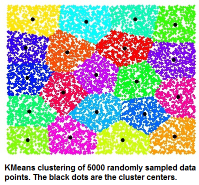
1. Choose the initial centroids so that they are having average distance among all the distances.
2. Run at least log(N) iterations of Lloyd's algorithm, where N is the number of observations in the data set
3. Access Mostly Uused Products by 50000+ Subscribers
4. Choose the initial centroids so that they are far away from each other
Ans : 4
Exp : The k-means algorithm takes as input the number of clusters to generate, k, and a set of observation vectors to cluster. It returns a set of centroids, one for each of the k clusters. An observation vector is classified with the cluster number or centroid index of the centroid closest to it.
A vector v belongs to cluster i if it is closer to centroid i than any other centroids. If v belongs to i, we say centroid i is the dominating centroid of v. The k-means algorithm tries to minimize distortion, which is defined as the sum of the squared distances between each observation vector and its dominating centroid. Each step of the k-means algorithm refines the choices of centroids to reduce distortion. The change in distortion is used as a stopping criterion: when the change is lower than a threshold, the k-means algorithm is not making sufficient progress and terminates. One can also define a maximum number of iterations.
Since vector quantization is a natural application for k-means, information theory terminology is often used. The centroid index or cluster index is also referred to as a "code" and the table mapping codes to centroids and vice versa is often referred as a "code book". The result of k-means, a set of centroids, can be used to quantize vectors. Quantization aims to find an encoding of vectors that reduces the expected distortion. This question is about the properties that make k-means an effective clustering heuristic, which primarily deal with ensuring that the initial centers are far away from each other. This is how modern k-means algorithms like k-means++ guarantee that with high probability Lloyd's algorithm will find a clustering within a constant factor of the optimal possible clustering for each k.
All routines expect obs to be a M by N array where the rows are the observation vectors. The codebook is a k by N array where the i'th row is the centroid of code word i. The observation vectors and centroids have the same feature dimension. As an example, suppose we wish to compress a 24-bit color image (each pixel is represented by one byte for red, one for blue, and one for green) before sending it over the web. By using a smaller 8-bit encoding, we can reduce the amount of data by two thirds. Ideally, the colors for each of the 256 possible 8-bit encoding values should be chosen to minimize distortion of the color. Running k-means with k=256 generates a code book of 256 codes, which fills up all possible 8-bit sequences. Instead of sending a 3-byte value for each pixel, the 8-bit centroid index (or code word) of the dominating centroid is transmitted. The code book is also sent over the wire so each 8-bit code can be translated back to a 24-bit pixel value representation. If the image of interest was of an ocean, we would expect many 24-bit blues to be represented by 8-bit codes. If it was an image of a human face, more flesh tone colors would be represented in the code book.k-means clustering is a method of vector quantization, originally from signal processing, that is popular for cluster analysis in data mining. k-means clustering aims to partition n observations into k clusters in which each observation belongs to the cluster with the nearest mean, serving as a prototype of the cluster. This results in a partitioning of the data space into Voronoi cells. The problem is computationally difficult (NP-hard); however, there are efficient heuristic algorithms that are commonly employed and converge quickly to a local optimum. These are usually similar to the expectation-maximization algorithm for mixtures of Gaussian distributions via an iterative refinement approach employed by both algorithms. Additionally, they both use cluster centers to model the data; however, k-means clustering tends to find clusters of comparable spatial extent, while the expectation-maximization mechanism allows clusters to have different shapes
Question : You and your friends have just measured the heights of your dogs (in millimetres):
The heights (at the shoulders) are: 600mm, 470mm, 170mm, 430mm and 300mm.
Find out the Variance
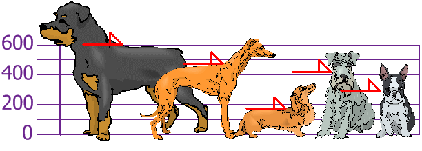
1. 2000
2. 20000
3. Access Mostly Uused Products by 50000+ Subscribers
4. Not enough information to calculate the mean
Question : You and your friends have just measured the heights of your dogs (in millimetres):
The heights (at the shoulders) are: 600mm, 470mm, 170mm, 430mm and 300mm.
Find out the Standard Deviation
1. 147
2. 140
3. Access Mostly Uused Products by 50000+ Subscribers
4. Not enough information to calculate the mean
Question : All HadoopExam website subscribers information is stored in the MySQL database,
Which tool is best suited to import a portion of a subscribers information every day as files into HDFS,
and generate Java classes to interact with that imported data?
1. Hive
2. Pig
3. Access Mostly Uused Products by 50000+ Subscribers
4. Flume